BOARD OF DIRECTORS
Jennifer Province Hong | President
Adrian Hong | President
Amy Province Neil | Board Member
DJ Neil | Board Member
CONTRIBUTORS
Olivia Craig | Trout Designs | www.troutdesigns.com
LOGO DESIGN
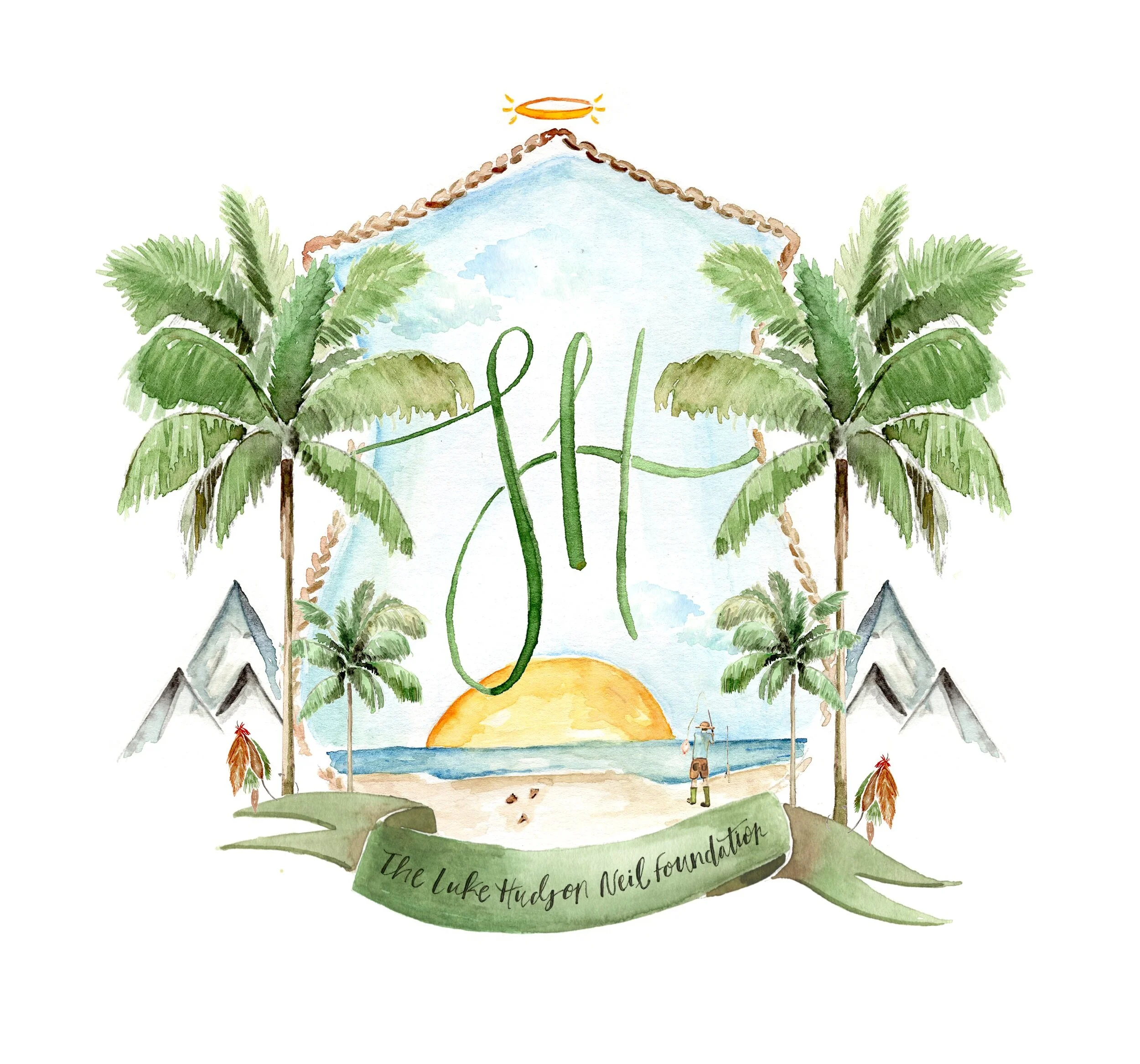
Luke´s crest has a tropical feel with palms trees on either side. A beach scene completes the lower-center of the crest with fishing poles in the sand and footprints walking towards the water, representing Luke. Below the beach scene is a simple banner with the full name of the foundation written inside. To represent Luke´s swaddle, a fishing fly is on either side of the banner connecting the banner to the palm trees. Behind the palms are subtle mountains representing the mountains in Tennessee.
I am picturing the inside of the crest to be a light blue, representing the sky (as you can tell from clouds at the top). Above the crest is a little halo representing Luke´s life. I positioned the halo at the top of the crest, above the sky and clouds, to represent the Luke´s spirit in heaven.
I am picturing the shape of the crest itself to be some sort of tied rope, relating to the overall fishing/nautical theme. I also think it would be nice to make the banner, as well as Luke´s initials, Tennessee orange.
WEB DESIGN
Kelly Valeria | designed@by-kv.com


